What we build
A kebab shop and a law firm should not look like the same template.
Every site starts from the thing the business is. Two colours come from the subject, one surprising colour marks the thing to remember, and the first screen shows the one thing the customer came for. Twelve kinds of business, twelve different pages.
Twelve concepts
Takeaways, grills and food trucks
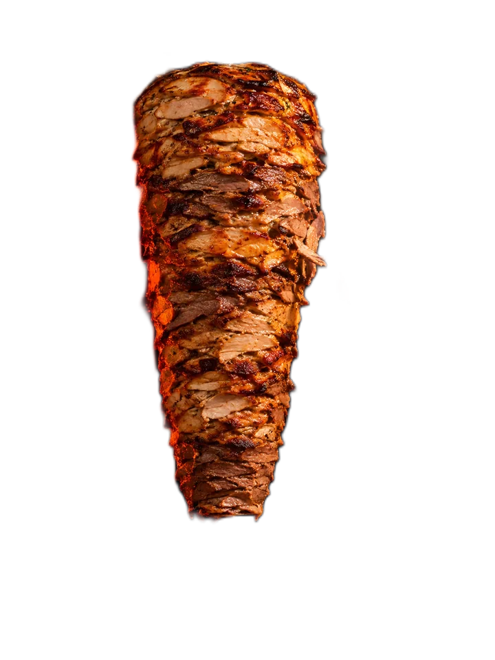
Want one like this?The food is the hero, standing between two giant words, with the phone number and a price where a hungry person looks first. One neon sign says the kitchen is open late.
Cafés and bakeries
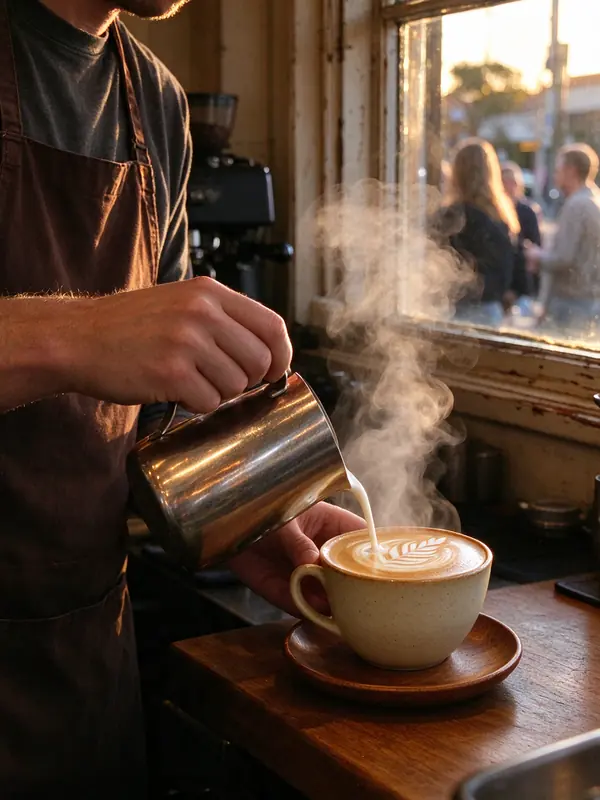
Want one like this?The room at 7am fills the page, with today's menu pinned to it and the two things people check first: is it open, and what's good today. One word in pink.
Live: move across the photo. It ripples like the coffee.

Plumbers, electricians and trades
Want one like this?For someone with a leak, comparing three tabs on a phone. A real face, the phone number as the biggest thing on the page, and the licence in the top strip. Orange only where you tap.
Live: move over the blue. It behaves like water.

NDIS, health and care
Want one like this?Calm colours, larger type and a real moment instead of a stock model. Reassurance comes before any form, and the process is three steps, not a wall of services.
Law firms
Want one like this?No photo at all: one sentence set large, with one word in claret, and the first-meeting fee stated up front for a visitor who is judging competence.
Accountants and advisers
Want one like this?A stance for a headline, circled by hand, and the fixed fees laid out like a ledger, because the visitor is comparing prices.

Salons, barbers and beauty
Want one like this?Laid out like a fashion page: the result beside the words, the price list next to her, and booking that works at 11pm. One signature in electric blue.
Builders and renovators
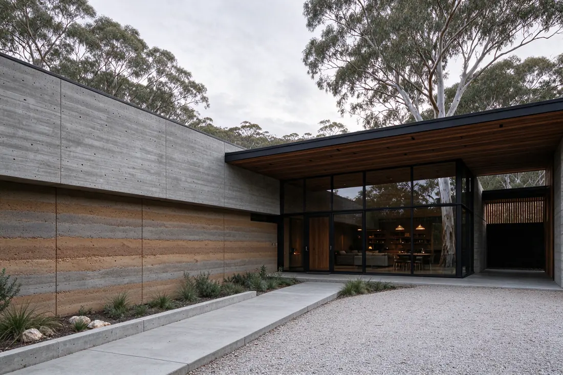
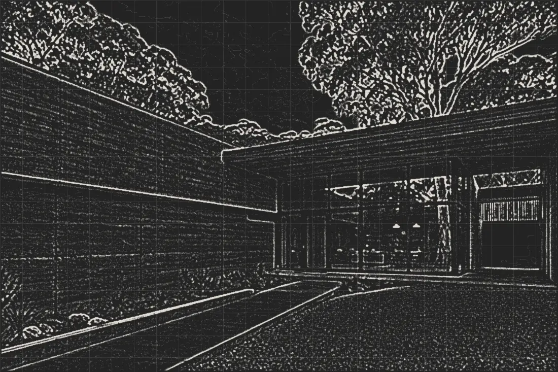
Want one like this?One finished house, full-bleed, with a two-word promise set across it and the proof in a single line. The work is the site; your photos drop in.
Live: slide across the photo to go from the drawing to the finished house.

Products and producers
Want one like this?One product, oversized, beside one giant word, with the price and the button right there. The button is fuchsia, the colour of what the bees visit.
Live: bring your mouse close to the pink button. It is sticky.
Laundries and local services
Want one like this?Plain, certain and local. The turnaround is the headline, the price is a sticker on the door, and hours, address and the price list fit on one screen.
Live: grab the red price sticker and drag it.
Community groups and associations
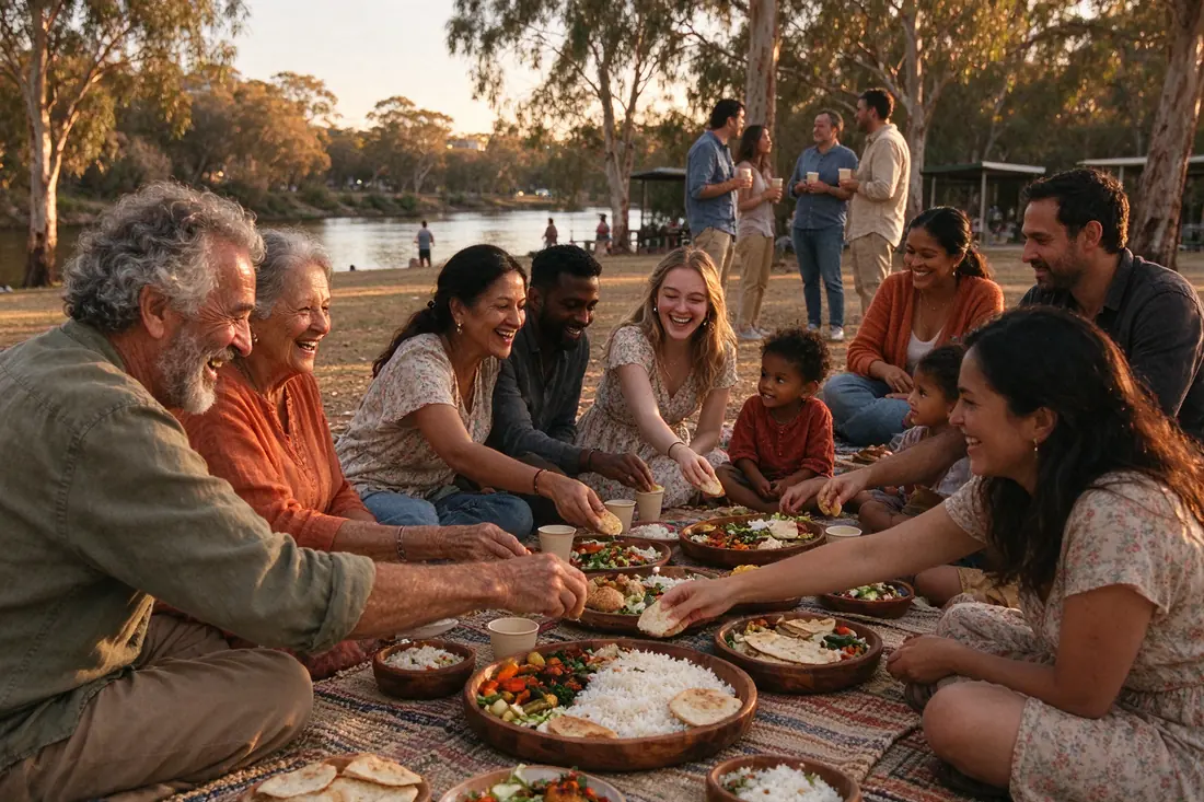
Want one like this?The people are the page. Join and volunteer are always on screen, the next two events sit beside them, the site speaks the community's languages, and the committee edits all of it.

Gyms, studios and martial arts
Want one like this?The floor at 5am in black and white, today's session running across an LED board, and memberships laid out like a menu.
Live: the board keeps ticking.
Concepts drawn for this page. The businesses are invented, the photos are stand-ins and the phone numbers are not real. Each would be built with your own photos and words, custom-coded or on WordPress, at the same fixed price.
The method
Two colours from the subject. One that surprises. One job per screen.
The two base colours come from the thing you sell: charcoal and chilli, crema and espresso, sage and teal. They sit close together, so the page feels calm and of a piece.
Then one colour from outside that family, used on one small thing only: a single word, the button, a hand-drawn mark, a sticker. It is the part people remember, and it points at the one thing a visitor came to do. The type matches the voice: loud for food and gyms, warm serif for cafés and community, plain sans for trades and care, old-style serif for law and money.
Every site
- Phone, hours and location within one scroll on a phone
- Contact that works without a form
- Proof next to the action: ratings, licences, registrations, years
- Menus, services, events, projects and people as things you edit yourself
- ABN, privacy, Google Business Profile and the trust signals your industry expects
- Domain, hosting and email in your name